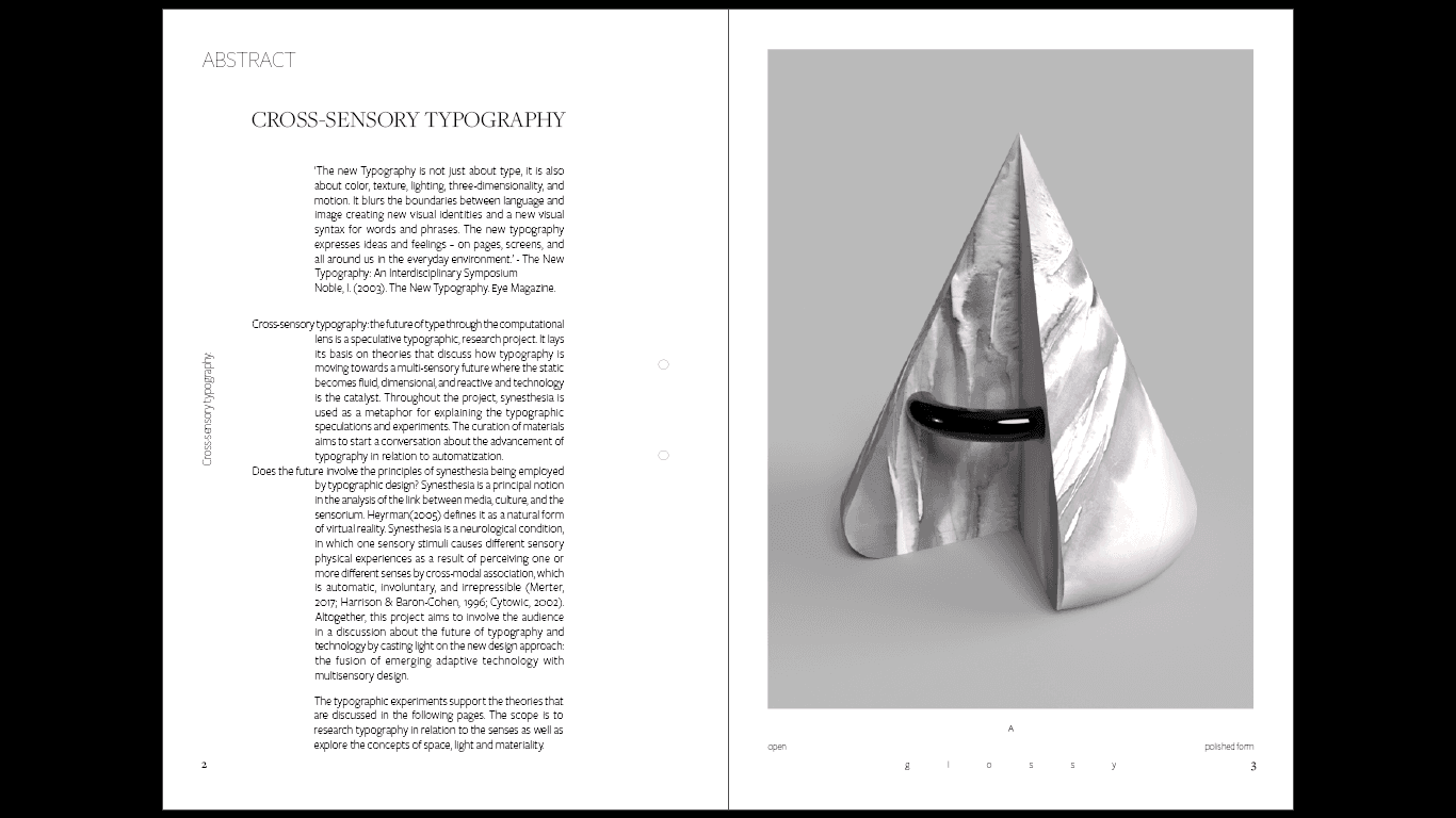
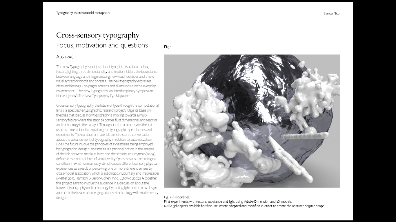
The new Typography is not just about type, it is also about colour, texture, lighting, three dimensionality and motion. It blurs the boundaries between language and image creating new visual identities and a new visual syntax for words and phrases. The new typography expresses ideas and feelings – on pages, screens and all around us in the everyday environment. - The New Typography: An Interdisciplinary Symposium, Noble, I. (2003). The New Typography. Eye Magazine
|
|
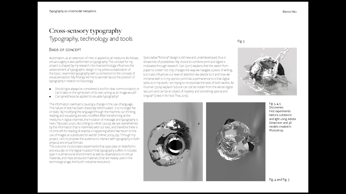
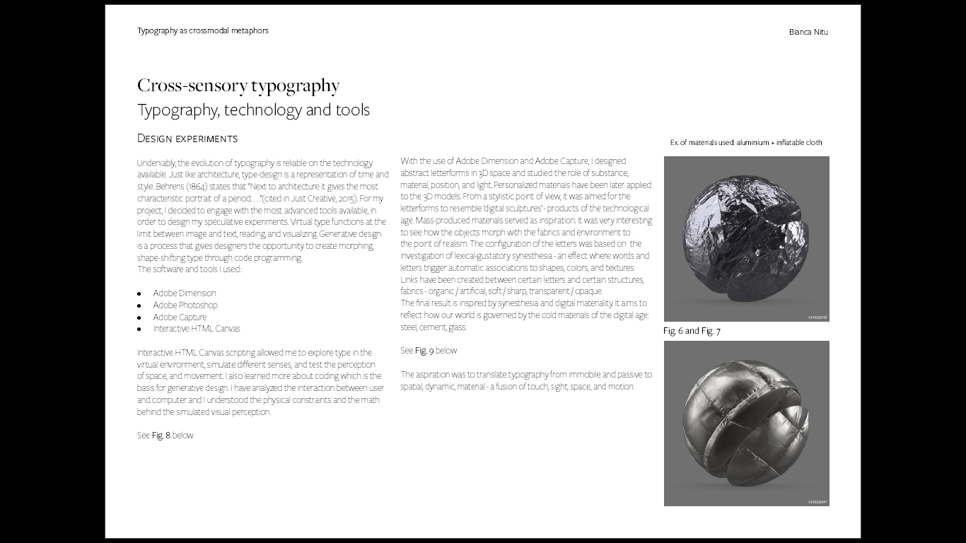
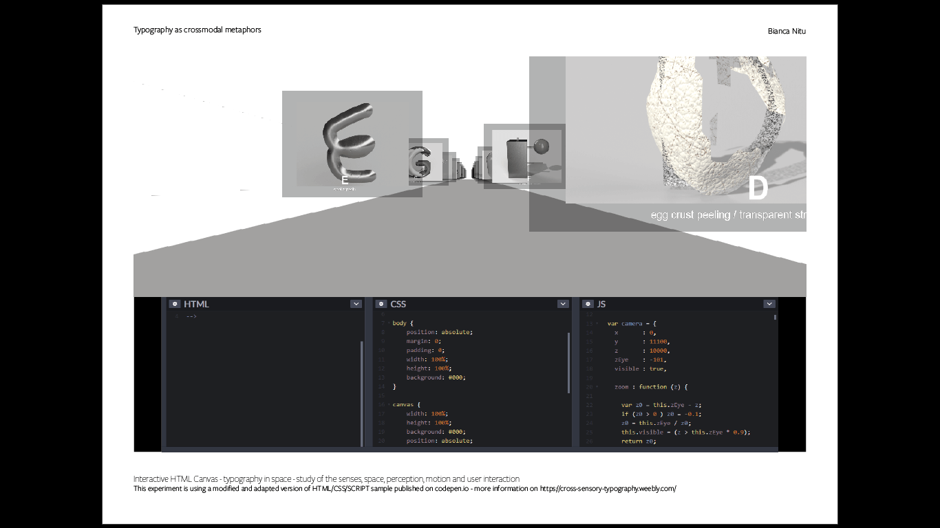
Undeniably, the evolution of typography is reliable on the technology available. Just like architecture, type-design is a representation of time and style. Behrens (1864) states that “Next to architecture it gives the most characteristic portrait of a period. . .” (cited in Just Creative, 2015). For my project, I decided to engage with the most advanced tools available, in order to design my speculative experiments. Virtual type functions at the limit between image and text, reading, and visualizing.
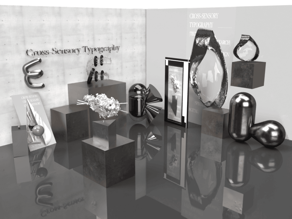
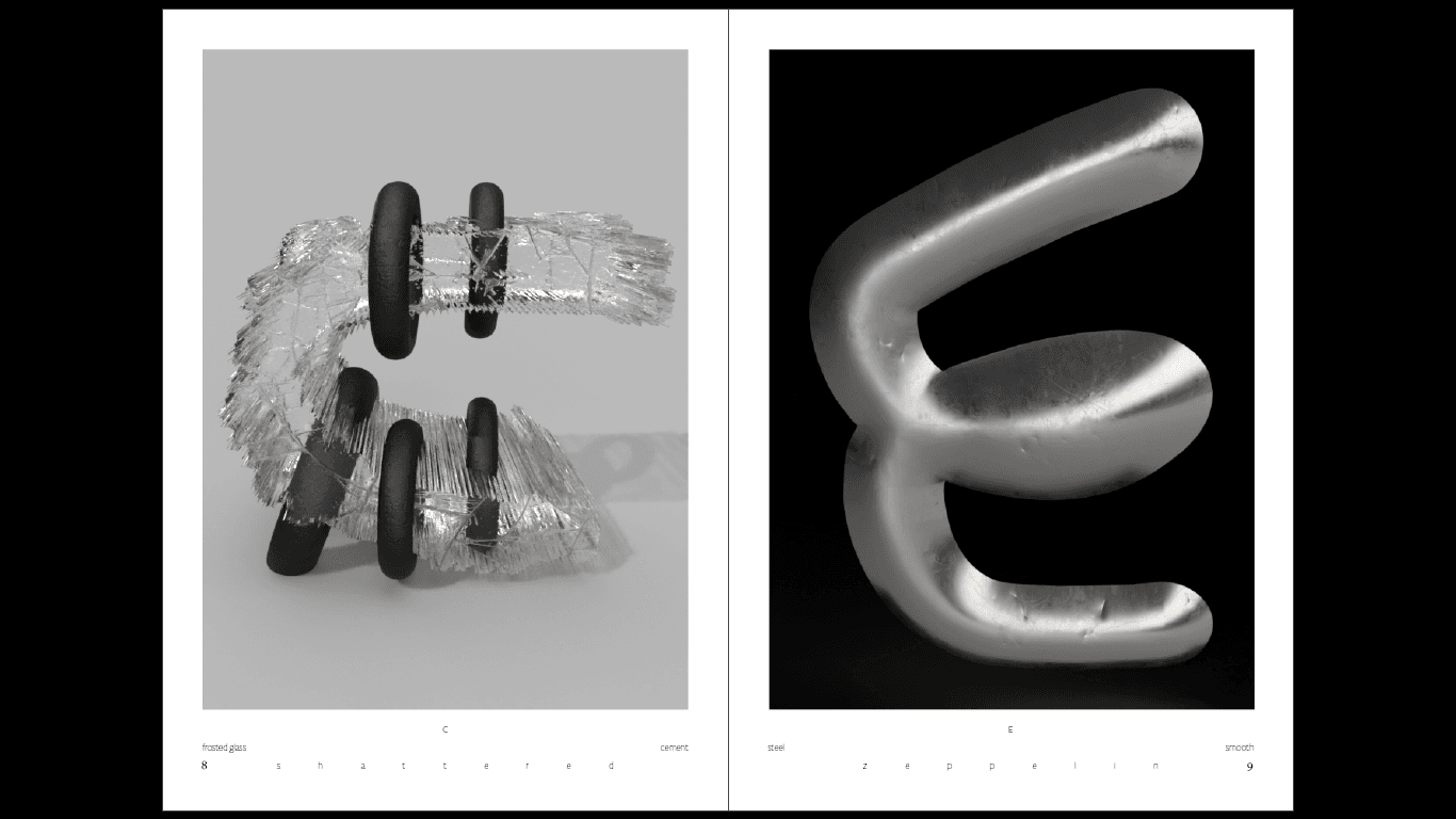
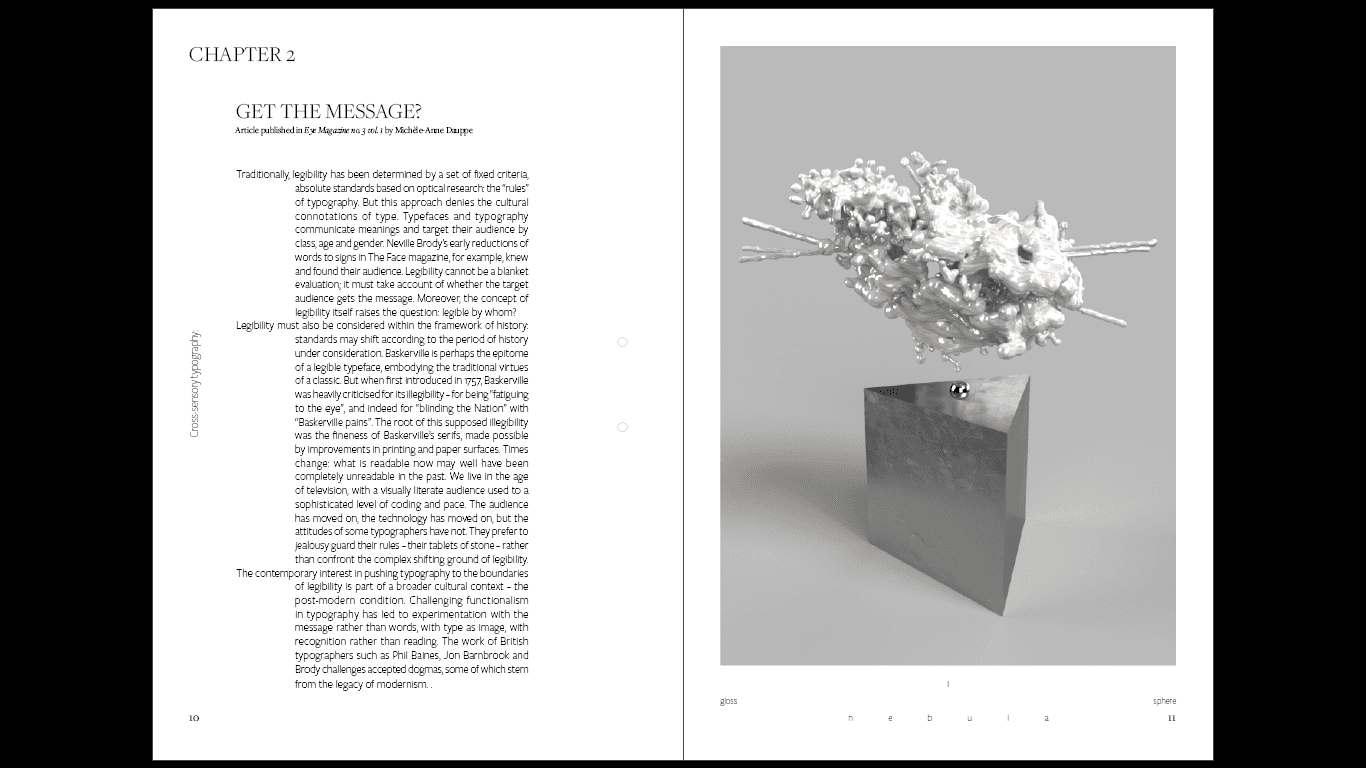
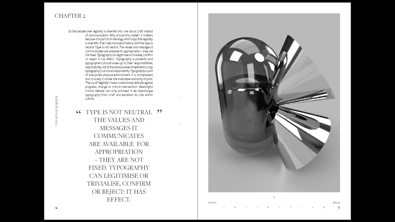
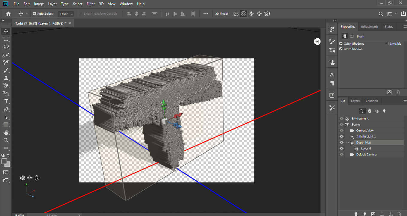
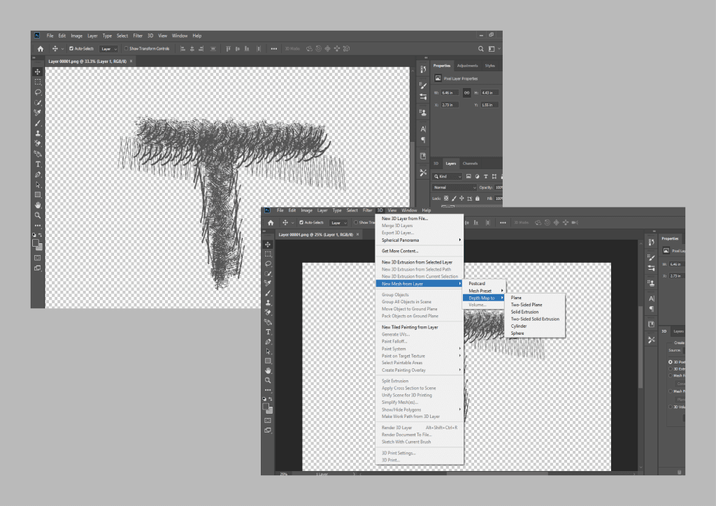
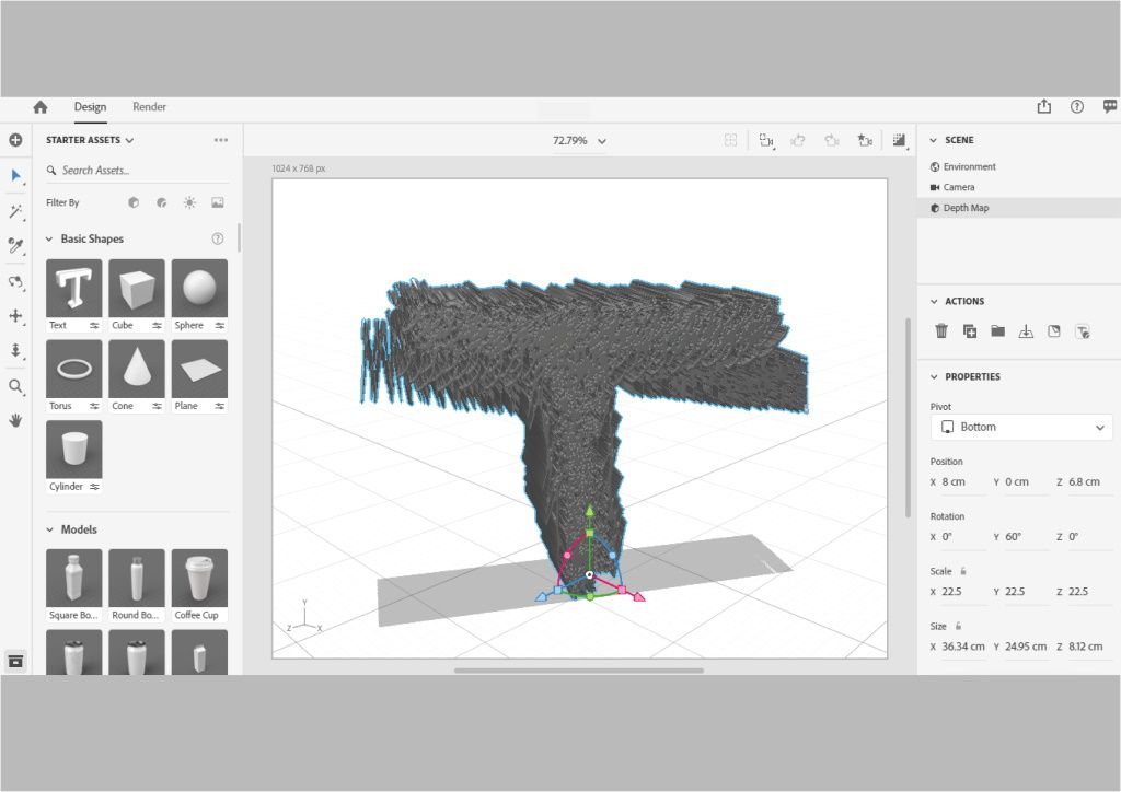
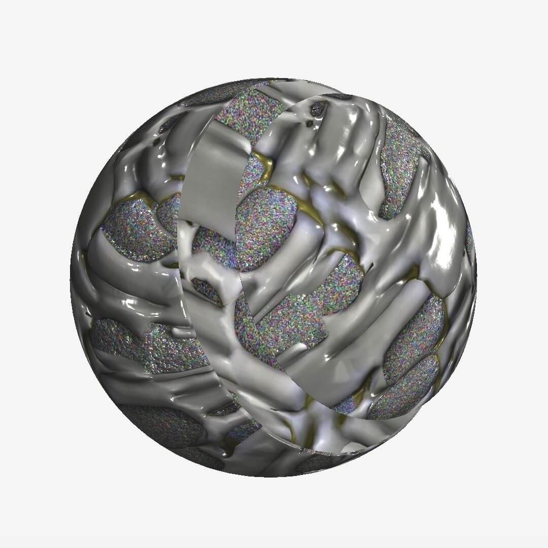
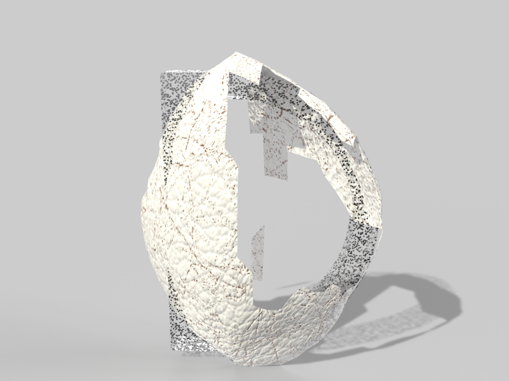
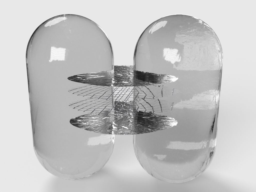
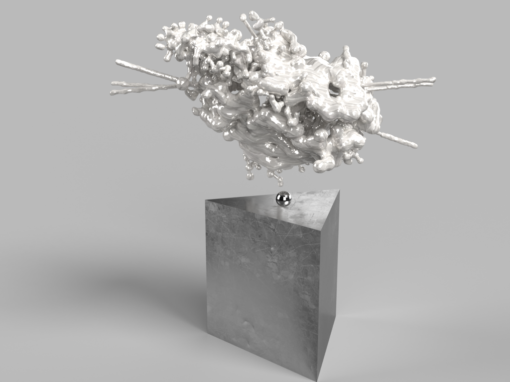
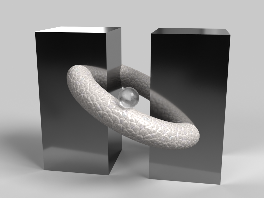
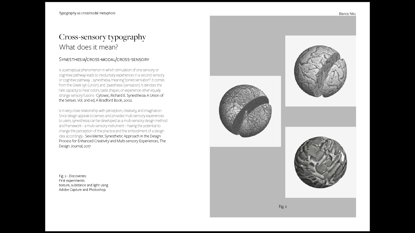
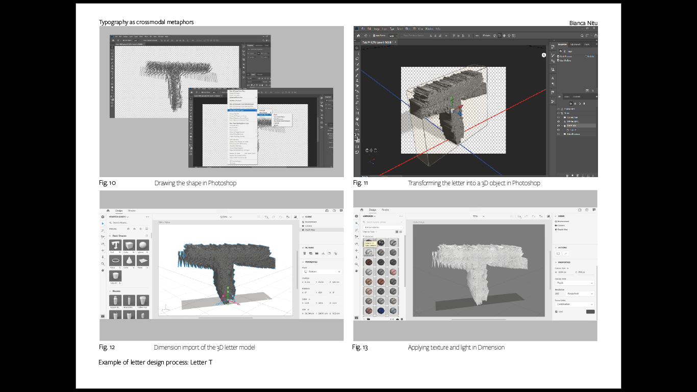
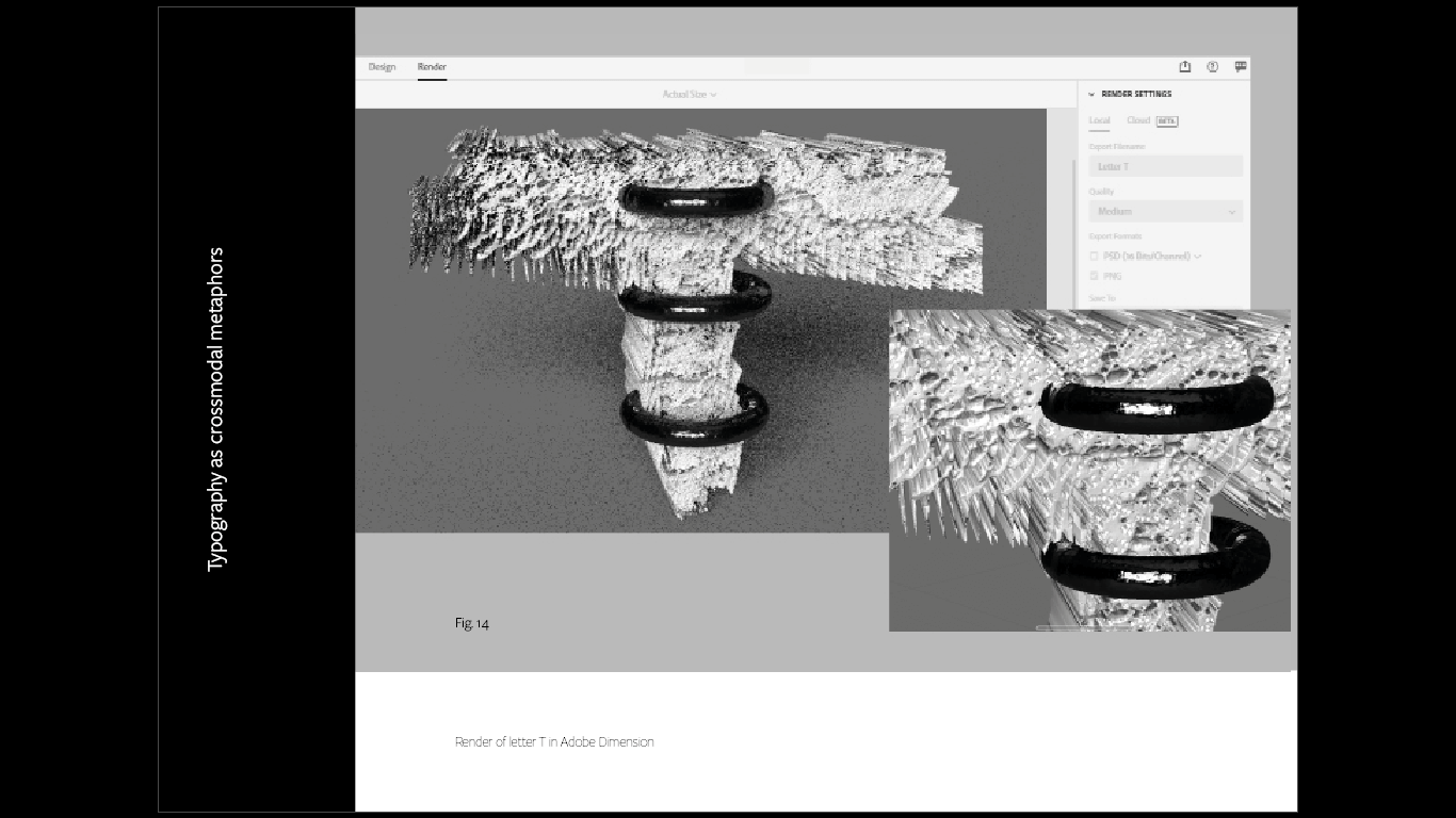
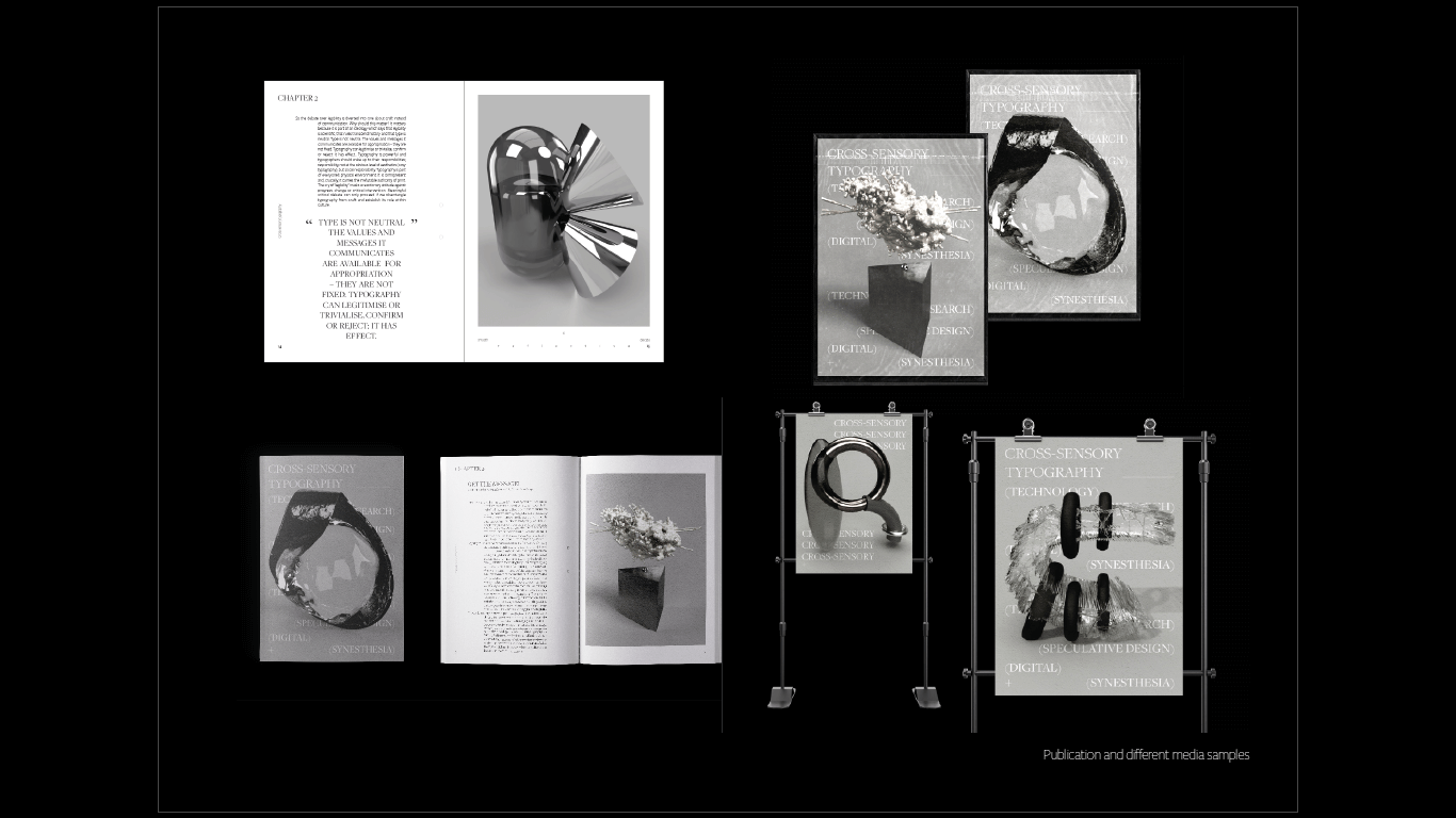
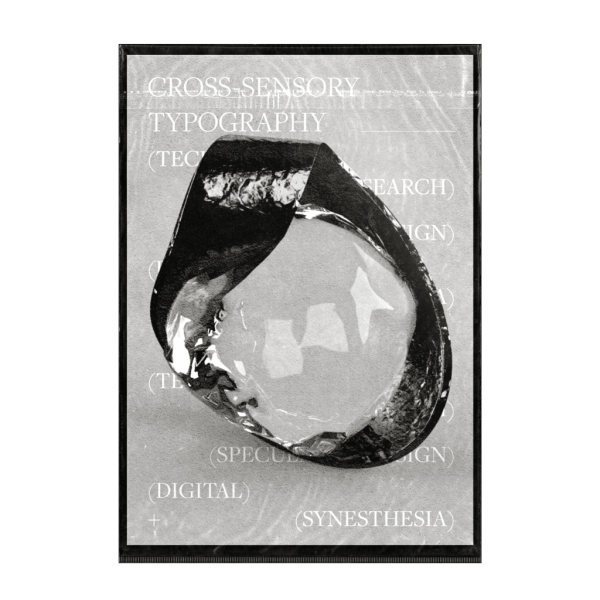
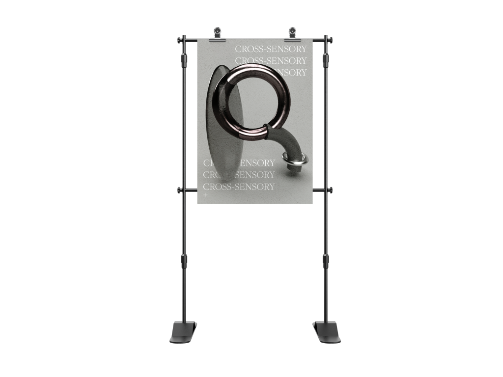
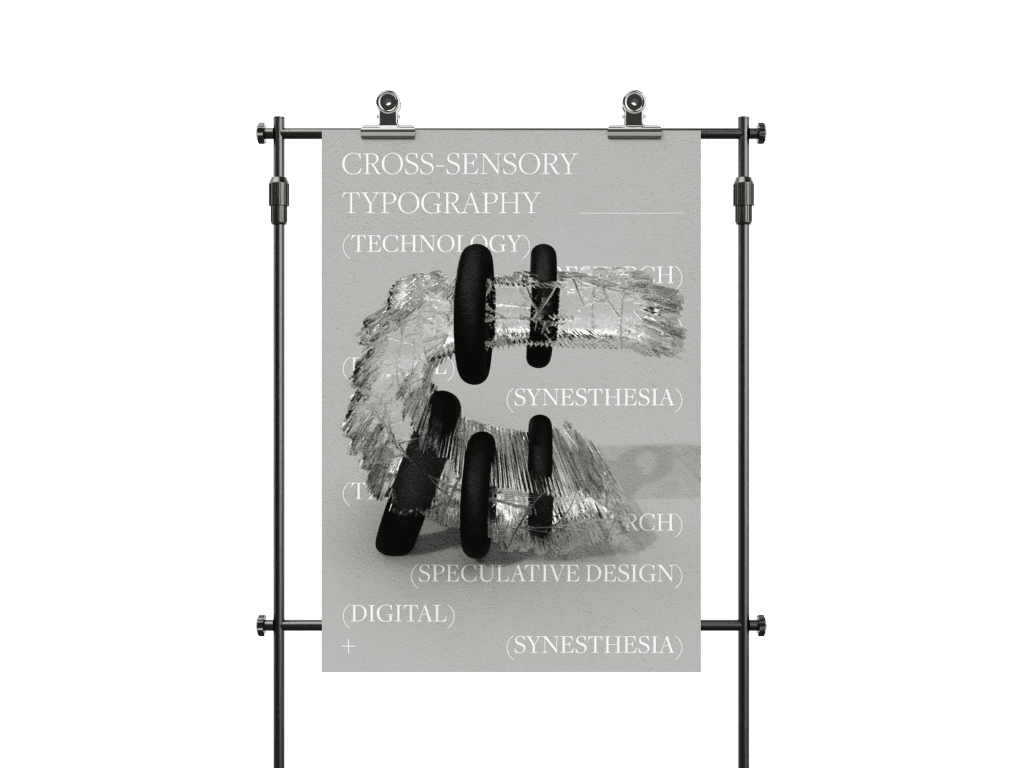
With the use of Adobe Dimension and Adobe Capture, I designed abstract letter-forms in 3D space and studied the role of substance, material, position, and light. I have created personalized materials that I have later applied to the 3D models (created in Photoshop). From a stylistic point of view, I aimed for the letter-forms to resemble "digital sculptures" - products of the technological age. I have used mass-produced materials as inspiration. It was very interesting to see how the objects morph with the fabrics and environment to the point of realism.
With the use of Adobe Dimension and Adobe Capture, I designed abstract letter-forms in 3D space and studied the role of substance, material, position, and light. I have created personalized materials that I have later applied to the 3D models (created in Photoshop). From a stylistic point of view, I aimed for the letter-forms to resemble "digital sculptures" - products of the technological age. I have used mass-produced materials as inspiration. It was very interesting to see how the objects morph with the fabrics and environment to the point of realism.
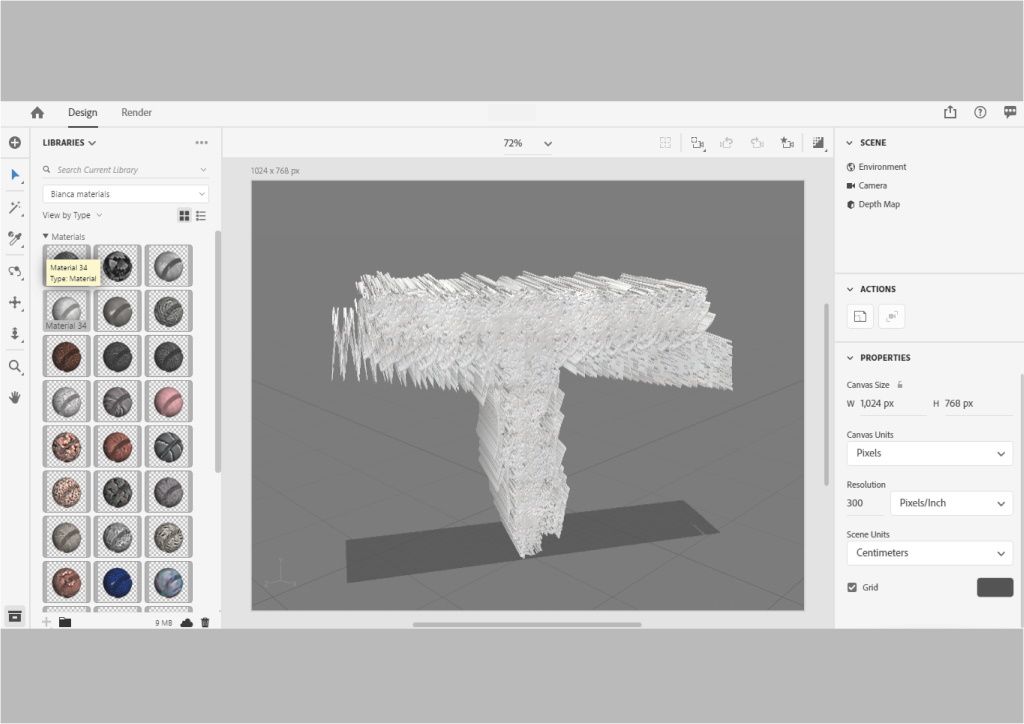
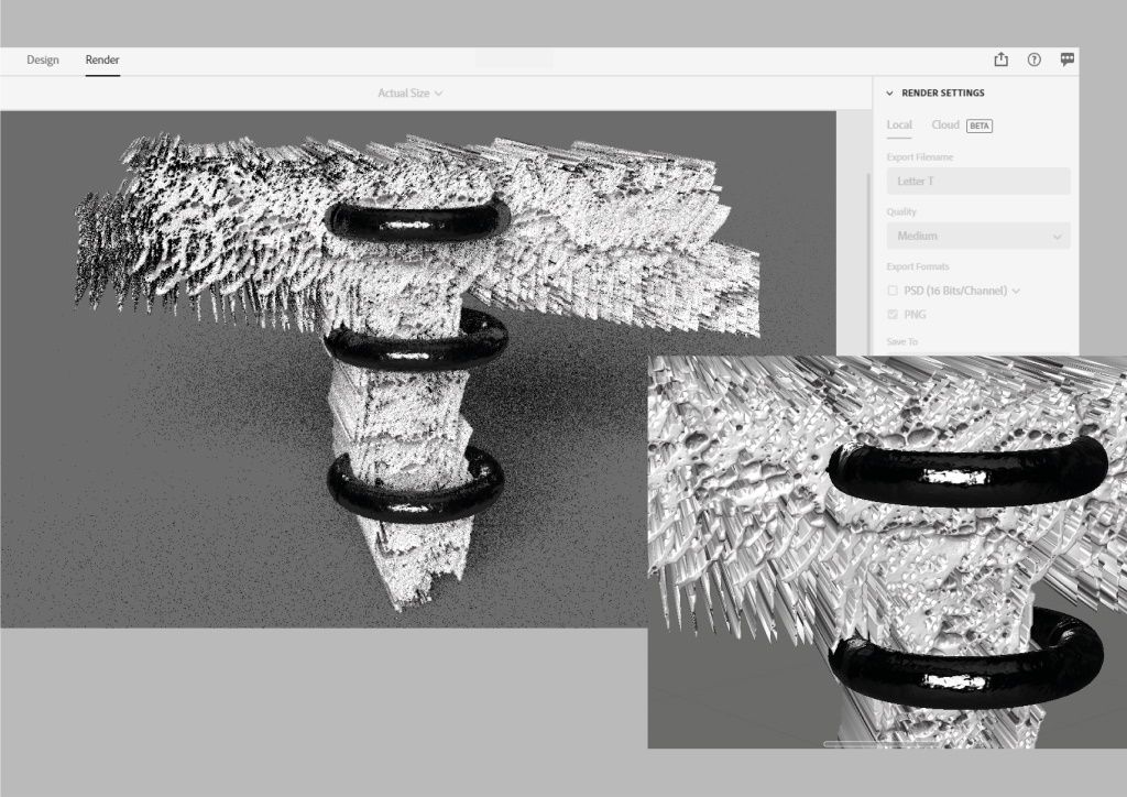
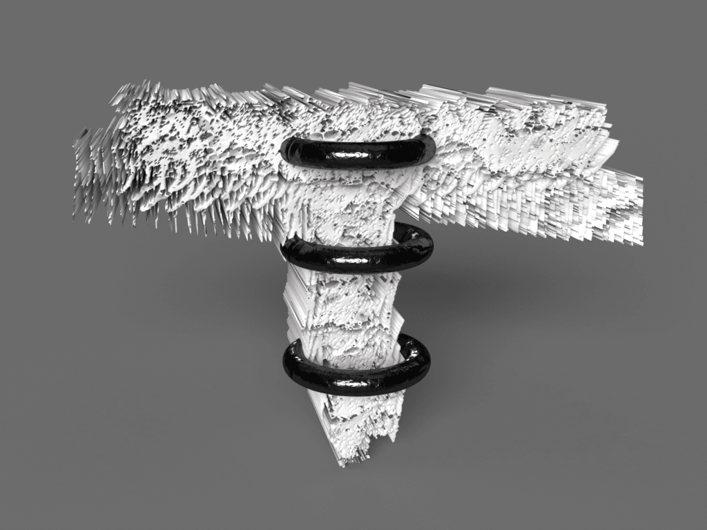
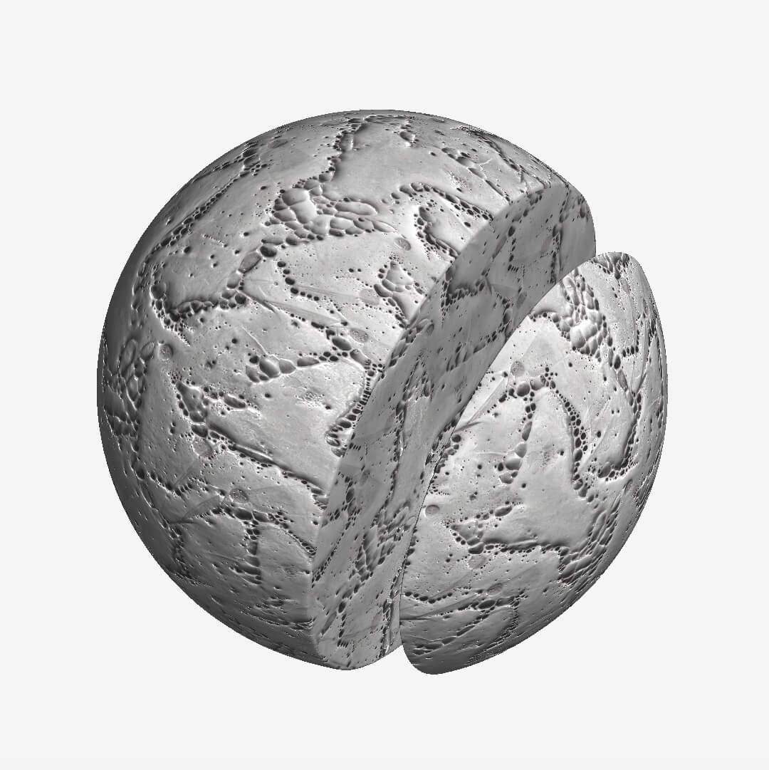
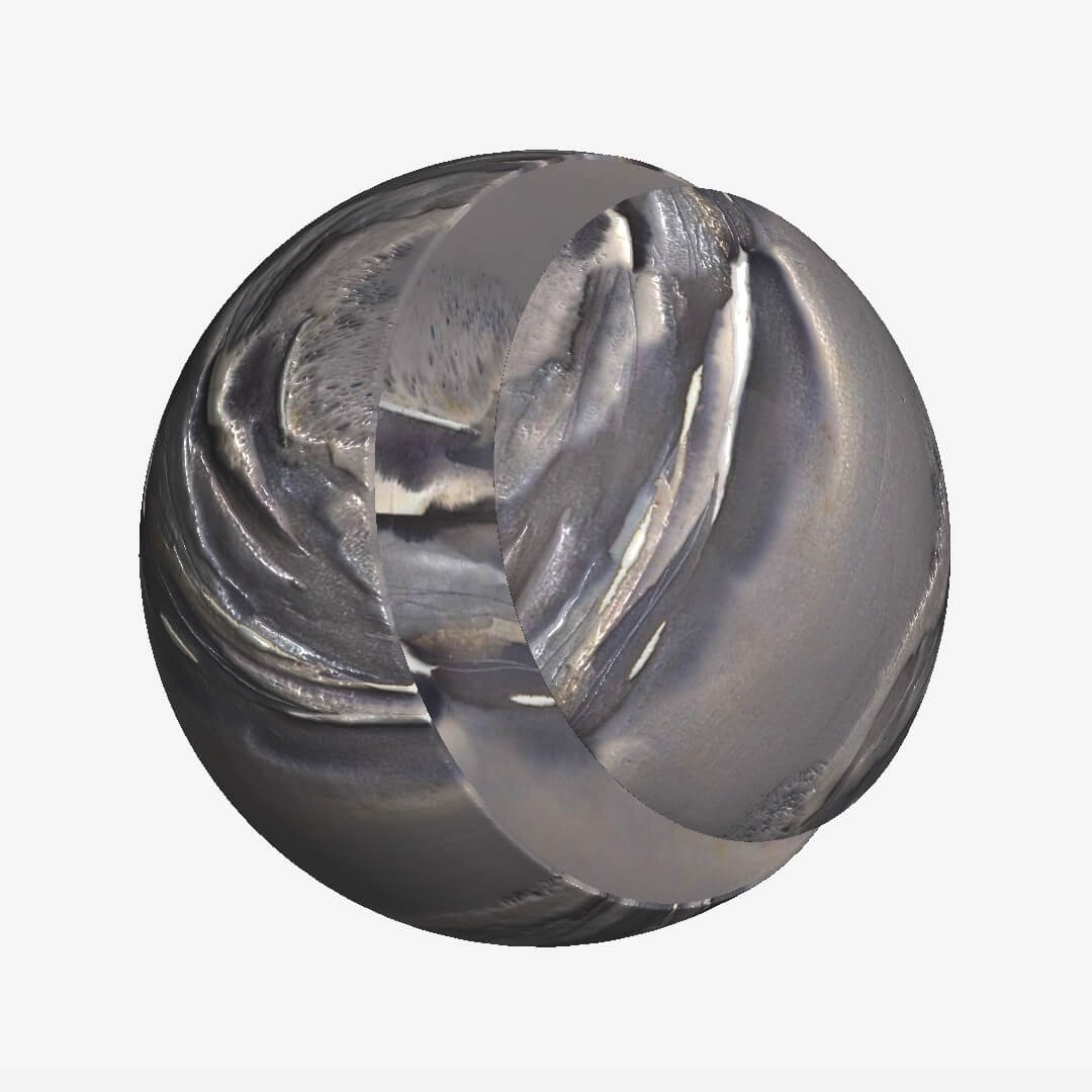
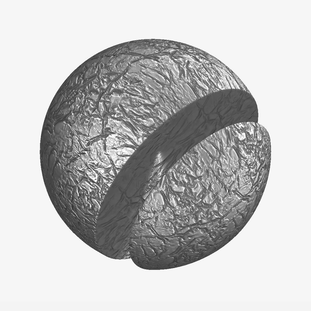
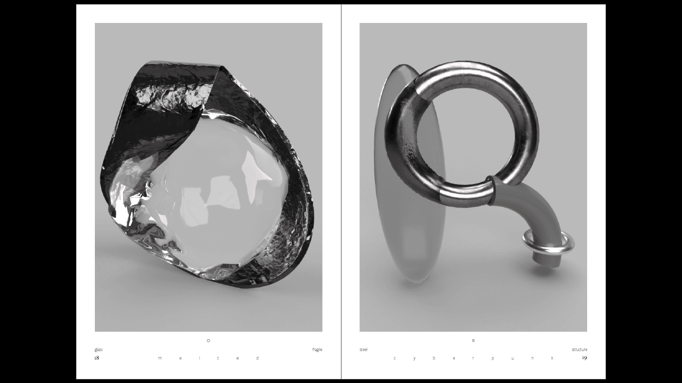
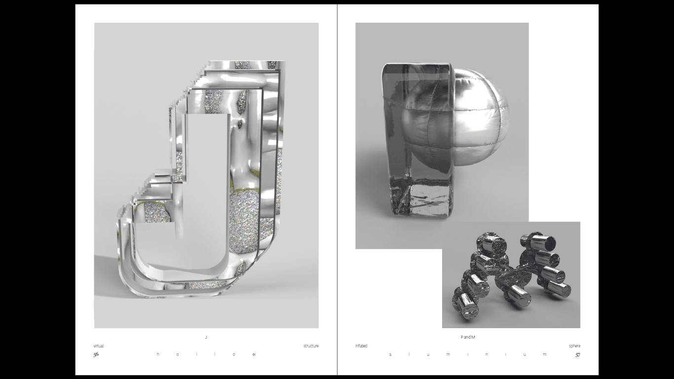
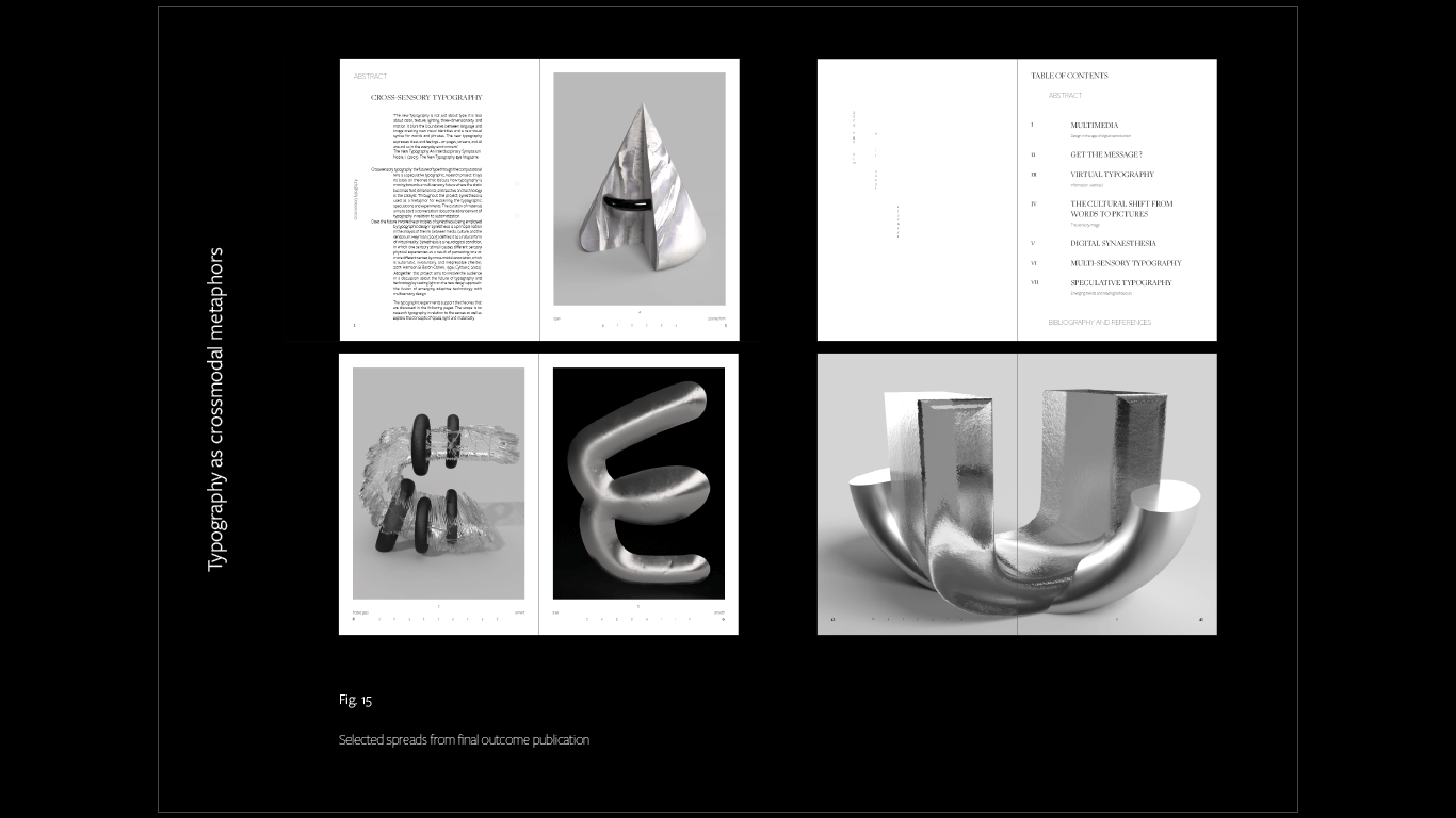
The configuration of the letters was based on my investigation of lexical-gustatory synesthesia - an effect where words and letters trigger automatic associations to shapes, colors, and textures. Based on this, I created links between certain letters and certain structures, fabrics - organic/artificial, soft/sharp, transparent/opaque. The final result is inspired by synesthesia and digital materiality. It aims to reflect how our world is governed by the cold materials of the digital age: steel, cement, glass. The aspiration was to translate typography from immobile and passive to spatial, dynamic, material - a fusion of touch, sight, space, and motion.
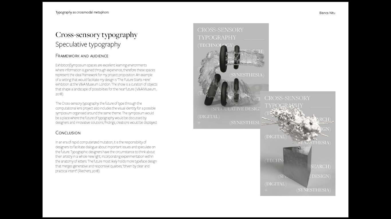
The project puts the theories in practice, adds to them through experimentation, speculation, and interaction. It makes the ideas fresh and visible. The project is not trying to predict the future but “is using design as a platform to open up all sorts of possibilities that can be discussed, debated and used to collectively define a preferable future for a given group of people” (Dunne and Raby, 2013).
The project puts the theories in practice, adds to them through experimentation, speculation, and interaction. It makes the ideas fresh and visible. The project is not trying to predict the future but “is using design as a platform to open up all sorts of possibilities that can be discussed, debated and used to collectively define a preferable future for a given group of people” (Dunne and Raby, 2013).
The curation of materials aims to start a conversation about the advancement of typography in relation to automation. Does the future involve the principles of synesthesia being employed by typographic design?
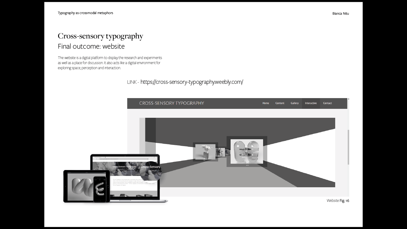
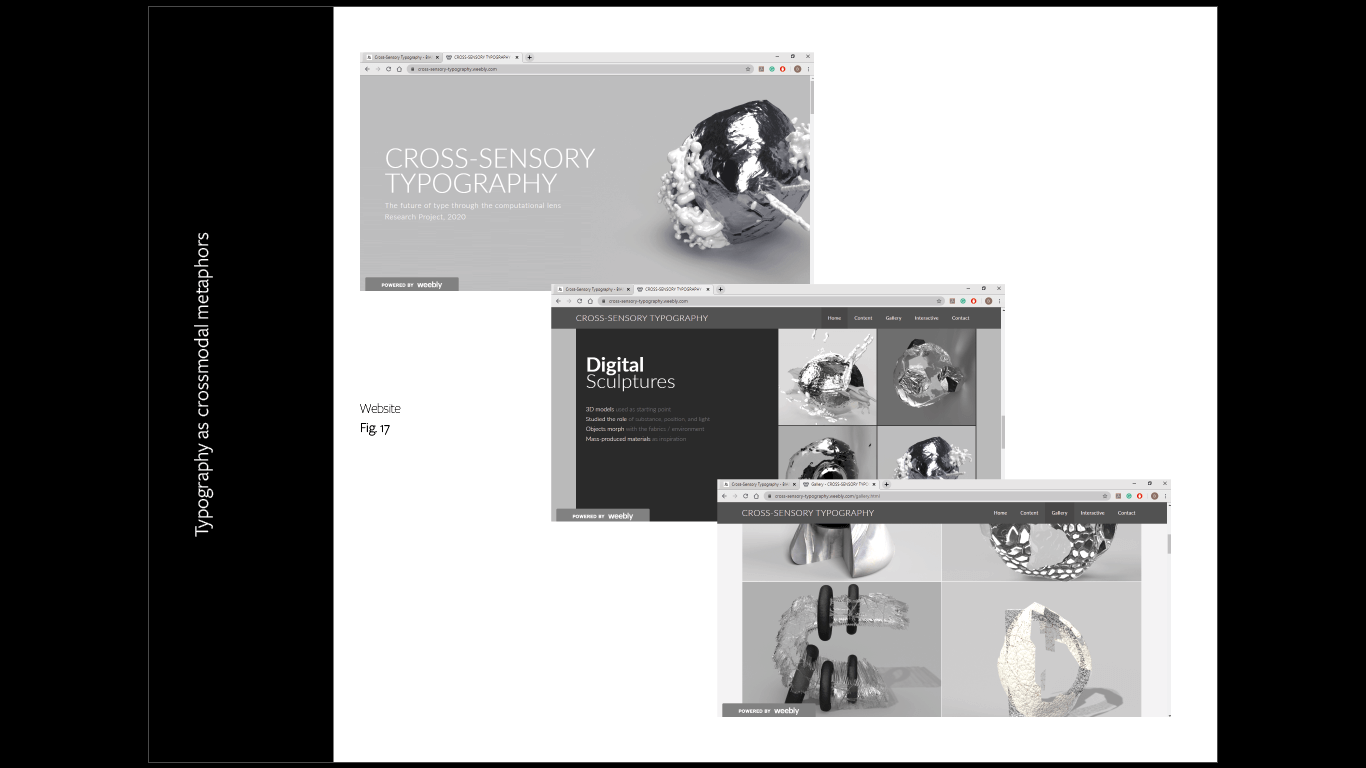
Altogether, this project aims to involve the audience in a discussion about the future of typography and technology by casting light on the new design approach: the fusion of emerging adaptive technology with multi-sensory design.
Altogether, this project aims to involve the audience in a discussion about the future of typography and technology by casting light on the new design approach: the fusion of emerging adaptive technology with multi-sensory design.
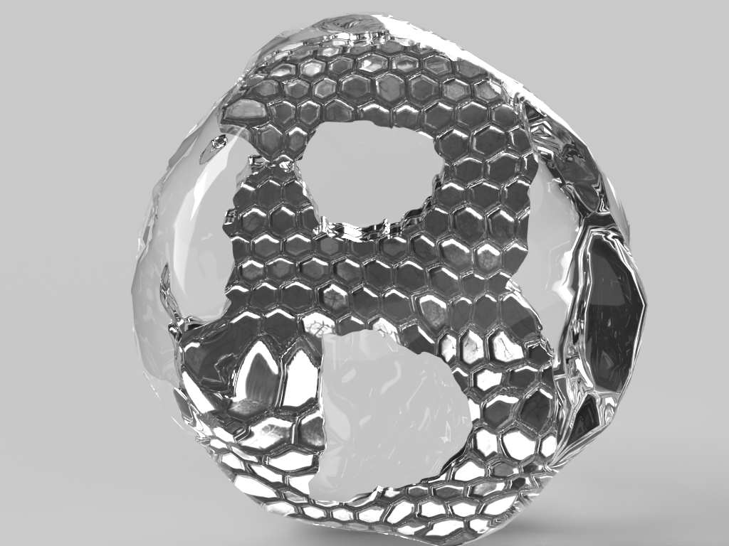
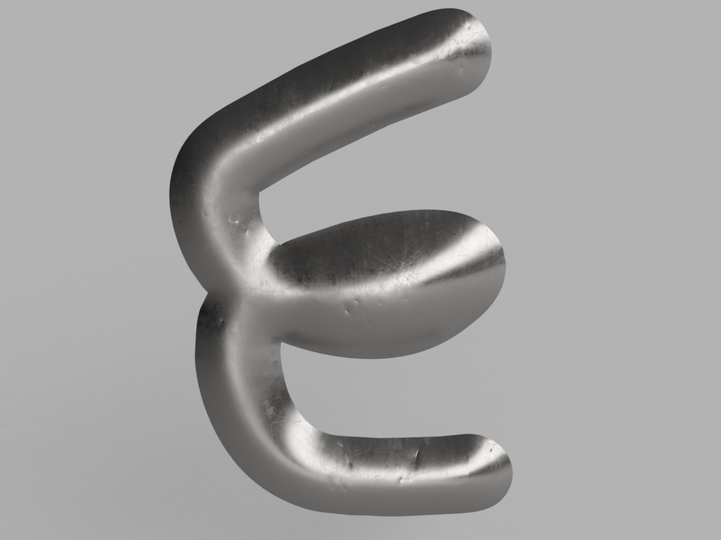
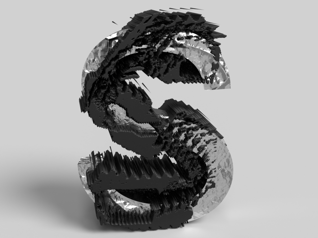
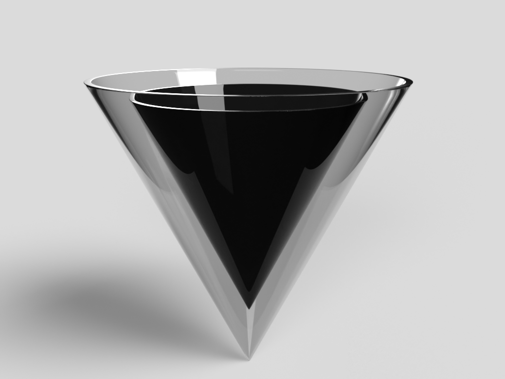
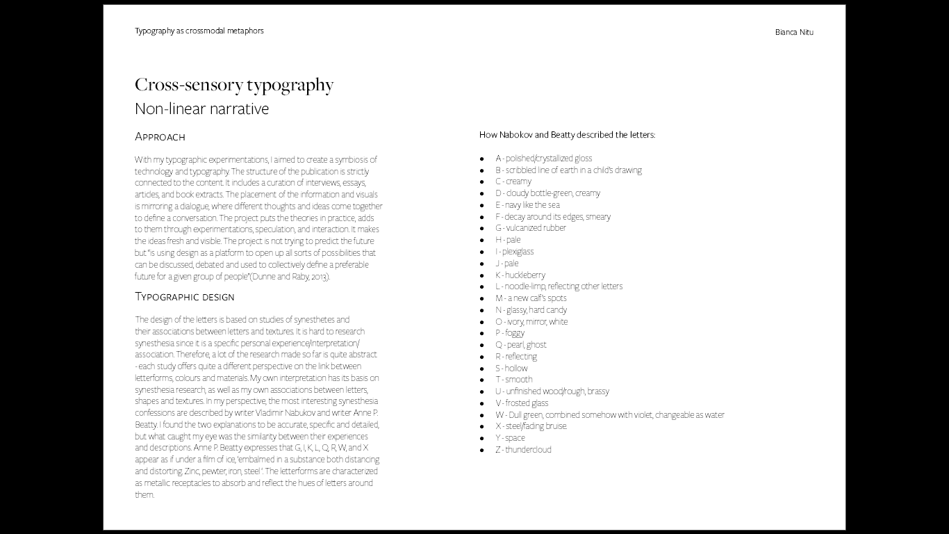
The design of the letters is based on studies of synesthetes and their associations between letters and textures. It is hard to research synesthesia since it is a specific personal experience/interpretation/association. Therefore, a lot of the research made so far is quite abstract - each study offers quite a different perspective on the link between letterforms, colors, and materials. My own interpretation has its basis on synesthesia research, as well as my own associations between letters, shapes, and textures. In my perspective, the most interesting synesthesia confessions are described by writer Vladimir Nabokov and writer Anne P. Beatty. I found the two explanations to be accurate, specific, and detailed, but what caught my eye was the similarity between their experiences and descriptions. Anne P. Beatty expresses that G, I, K, L, Q, R, W, and X appear as if under a film of ice, 'embalmed in a substance both distancing and distorting. Zinc, pewter, iron, steel '. The letterforms are characterized as metallic receptacles to absorb and reflect the hues of letters around them.
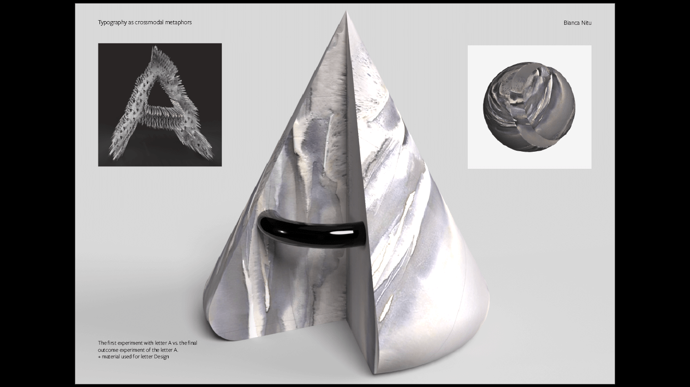
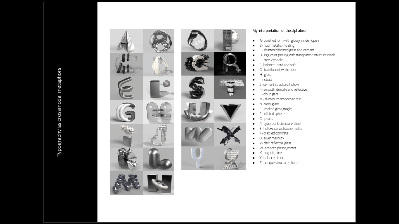
My interpretation of the alphabet is the following:
|
|
In an era of rapid computerized mutation, it is the responsibility of designers to facilitate dialogue about important issues and speculate on the future. Typographic designers have the circumstance to think about their artistry in a whole new light, incorporating experimentation within the anatomy of letters. The future most likely holds more typeface design that merges generative and responsive qualities, “driven by clear and practical intent” (Riechers, 2018).
